
Currents in Electronic Literacy
Rethinking Usability for Web 2.0 and Beyond
by William I. Wolff, Katherin Fitzpatrick, and Rene Youssef
1. I am fortunate to have had many wonderful teachers during my way-too-many years of education. But no teacher has so subtlety and thoroughly transformed how I understand the Internet—and, by extension, how I understand my place in the world—than John Slatin. This transformation happened during his graduate seminar, Multimedia, Accessibility, and the Virtual Body. The purpose of the course, it seems to me now (and despite what might have been on the syllabus), was to suggest that designing a Web page was a rhetorical act fraught with real-world implications. It was certainly not only about making the page look like what a designer had sketched on a scrap of paper. This idea blew me away. John’s Access First Design approach located the user—all users, regardless of (dis)ability—at the center of the design process. The designer was merely the mechanism for ensuring that everyone who wanted to be able to access and consume the information on a Web site should be able to. John’s approach was essentially an answer to the questions, “What if we looked at this issue from this new perspective? How would it change things?” Inherent in those deceptively simple questions are a curiosity to learn more, a desire to never maintain the status quo, and an eagerness to engage the world in new ways. I have tried to use those questions to inform all the courses I teach, the research I continue to pursue, and the challenges I face in my life. John closes his seminal article, “The Art of ALT,” with the sentence, “As rhetoricians of the Web and teachers of writing in webbed environments we can now participate in reshaping practice.” This article is an extension of the practice of writing that he reshaped by his teaching, example, and approach to life. —Bill Wolff
Introduction
2. In a groundbreaking 1983 presentation that initiated a user-centered focus on designing computing systems, Gould and Lewis suggested four main principles for designers. First, designers should know who their users will be. This could be achieved by careful study of users “cognitive, behavioral, anthropomorphic, and attitudinal characteristics” (50). Second, designers should work with a group of suspected users at the early stages of the design of the computing system. Third, in the early stages of the design process, those users should interact with prototypes and their performance should be evaluated. Fourth, when users have problems using a computer system, designers must fix them. Thus began the field of usability, which is dedicated to the idea that if a computer system or application is going to be successful it must be easy to use, efficient in terms of the amount of time it takes to use, and aesthetically pleasing to use. To achieve success in these areas, designers create usability studies. In these studies potential users are put through a series of goal-oriented tasks and their successes are measured along pre-determined scales. Often voice-aloud protocols are employed by asking the test subject pre-set and task-emergent questions and/or asking the subject to talk through the decisions they make when trying to reach their goal (Barnum & Dragga). Usability test methodologies have been applied to all manner of technologies with which humans interact; in this paper we will be focusing on usability studies designed to assess the usability of Web sites.
3. Nielson has argued for the considerable focus on the usability of Web sites because they reverse the traditional producer-consumer relationship. When someone buys a product in the store they pay for the product first and then experience its (often lack of) usability later (think about the difficulty of programming a VCR or understanding the vast assortment of buttons on a TV remote control). With Web sites, however, “users experience the usability of a site before they have committed to using it and before they have spent any money on potential purposes” (10). Since 1994, Nielsen and his partners have “identified literally thousands of usability problems and developed as many guidelines for avoiding them” (xvi). These problems have been located in three main areas: page design (how individual pages are laid out), content design (how the content is written and presented), and site design (how the entire Web site is organized) (Krug; Nielsen, Designing Web Usability; Barnum & Dragga). Along with advocates for Web Standards (Zeldman), usability advocates also argue for designing Web sites that are accessible for people with disabilities (Slatin & Rush; Clark) and many suggest that sites should also comply with readability standards (“About Readability — Tx Readability from The Accessibility Institute”).
4. Much, however, has changed in the world of computer human interaction since Gould and Lewis announced the need for user-centered design. Indeed, much has changed with the Web since Nielsen and others began testing Web site usability. The primary change has been the emergence of Web 2.0, which alters how users interact with Web sites. In 2003 Daughtery and O’Reilly invented the term “Web 2.0” to “capture the widespread sense that there's something qualitatively different about today’s Web” (par. 1). Web 2.0 sites and applications share three common characteristics that distinguish them from traditional Web sites. First is user-generated content. Traditional Web sites (like cnn.com) are passive in that the user can only read the content, click a few links, and then move on. Blogs, however, are active: users have the ability to enter their own content, comment on the others’ content, and share their content with anyone with an Internet connection. Second is that Web 2.0 sites and applications are often designed to interact seamlessly with other web sites and Web 2.0 applications. For example, by taking advantage of a programming language known as RSS and an application known as an RSS reader, users can subscribe to a blog that they enjoy. Every time the blog author adds a new post, the content of that post is automatically sent to the user’s RSS reader. They no longer have to visit the blog to read the content; rather, the content is sent to them. Third (and somewhat less important for this discussion) is the transformation of how companies structure their hardware and software systems: “On the one side, a single software provider, whose massive installed base and tightly integrated operating system and APIs give control over the programming paradigm; on the other, a system without an owner, tied together by a set of protocols, open standards and agreements for cooperation” (O’Reilly). Web 2.0 is the latter.
5. We have also seen a drastic change in the materiality and functionality of the Web browser. No longer merely a rectangle used to display Web pages, browsers are spaces that expand to include multiple tabs, dynamic sidebars (e.g., Diigo and Twitbin sidebars), functional address bar icons (e.g. the RSS and Zotero icons), and interactive toolbar buttons (e.g., Share on Facebook, Twitlet, and Add to Netvibes buttons) that enable (and encourage) interaction with Web 2.0 applications when the user is viewing a different site.
6. In Web 2.0, the shift from passive to active participation has radically transformed the way we interact and understand how the Web works. Users of static Web sites like cnn.com have only to learn how to navigate that particular site. A static Web site, like a VCR, is a self-contained product. Even though hyperlinks connected Web pages together, in Web 1.0 large-scale Web sites traditionally did not link from one to the next. Cnn.com did not offer links to nytimes.com. This is because the goal was to keep users in a self-contained site domain so they could consume only that site’s information (and increase the site’s ad revenues). It made sense, then, to construct usability studies that tested how users interacted with one particular site domain (just as designers conducted usability studies that tested how to use a single VCR model). Web 2.0, however, changes everything. It is no longer correct to assume that businesses and Web site designers (especially those whose product is information and not, say, clothes or lawn mowers) want users to stay on their site and only their site with the goal of profiting in some way from the user’s continued stay. In the age of Web 2.0 the transmission of information from one place to the next often takes precedence over maintaining time spent on a site and dollars generated from use.
7. Many have noted how Web 2.0 applications tend to ignore (and in many cases thwart) current usability standards (Hart et al.; Pilgrim; “Web 2.0 'neglecting good design'”). One need only experience reading certain blogs to suspect usability standards are being violated by the considerable scrolling, obnoxiously abundant sidebar links, and insufficient use of ALT text and title tags. However, just as usability advocates must challenge questionable Web 2.0 design practices, so to are Web 2.0 application functionalities challenging traditional usability study tests. Redish has noted the limitations of the prescribed activity-based structure of usability studies: “not all systems lend themselves to short, discrete scenarios. Not all scenarios have clear endings or known, correct answers. How do we evaluate the usability of systems that are too complex for our typical testing protocols?” (p. 102). Redish addresses her question by drawing on complex systems theory to advocate for usability studies that assess “work that domain experts do when solving open-ended, unstructured, complex problems involving extensive and recursive decision-making” (p. 102). She provides case studies that cover information analysts engaged in various real-world activities, such as how analysts work through problems outside of their field of expertise and how groups work toward a particular goal over time (pp. 107 - 108) to suggest ways we might broaden usability study testing procedures. Writing about the evolution of complex adaptive systems, Holland observes that it is the “process of becoming, rather than never-reached end points, that we must study if we are to gain insight” into their development (20). The Internet is one large complex adaptive system and Web 2.0 applications are increasing its complexity, connectedness, and adaptability.
8. This paper presents two case studies that raise significant questions about the viability of traditional usability standards and methodologies when applied to Web 2.0 sites and applications. First, we investigate and consider the implications of several ways users can share information across Web sites. Second, we investigate and consider the implications of the terms group, community, and network as they are applied across Web 2.0 sites. The case studies are informed by a larger research project designed to investigate new literacies emerging with Web 2.0 applications. In September 2008 we compiled a master inventory of Web 2.0 applications (n = 2,741) aggregated from Go2Web20.net, the leading Web 2.0 application archive; Alexa.com, the leader in internet traffic ratings; and http://movers20.esnips.com, a leading Web 2.0 tracker. From that list we determined purposive (n = 31) and random samples (n = 491) of Web 2.0 applications to study. This paper is informed by our analysis of the purposive sample. Results suggest that usability studies as they have been traditionally constructed are insufficient for understanding the dynamic, symbiotic, cross-site experiences contemporary users have with the Web.
Case Study: Sharing, Feeding, Embedding, and Toolbar-ing
9. Because designers of Web 2.0 applications are aware that their users have accounts, data, and colleagues on other Web 2.0 applications, most provide their users with an option to share content across sites. Sharing functionality promotes the idea of community within the site and within the Web 2.0 community as a whole, and gives its users freedom over content. There are four primary ways that Web 2.0 applications allow users to disseminate content: sharing, feeding, embedding, and toolbar integration. Each of these functions challenges certain traditional notions about how users interact with the Web.
Sharing
10. Most Web 2.0 applications offer their users the ability to share information by clicking on a share link, often represented by a button, which then posts the information to other Web 2.0 applications. Usually a share link is clearly marked as “share” and easily distinguishable from other content on the application’s site; however, the word “share” is sometimes replaced with a similar word like “add” or “bookmark.” Once users click on the share link, they must choose to share the content with a new Web 2.0 application. For example, the popular online photo editor, Picnik, provides users the ability to import from and export content to their computer and seven other Web 2.0 applications: Flickr, MySpace, Picasa, Facebook, Webs, WebShots, and Photobucket (Figure 1).

Figure 1. Picnik Save & Share Toolbar
11. If a user chooses to share their photo on Facebook, they select the Facebook link. Picnik asks the user for permission to connect to Facebook, and then Facebook asks the user for permission to allow Picnik access to the user’s profile. Once approved, the photo will appear in the user’s Facebook page where they can comment, add permissions, and other Facebook-related functions (Figure 2).
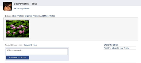
Figure 2. Facebook Window After a Picture on Picnik has been Shared
12. Traditional Web sites, such as the New York Times Web site, also often include share links so users can disseminate content. Unlike with Picnik, however, when a reader decides to share content on, say, MySpace, an unannounced window pops-up connecting users to MySpace’s share functionality. Once the user has shared the New York Times content with the friends in MySpace the window closes and they are free to continue navigating nytimes.com (Figure 3). Though in violation of usability standards (by not informing the user that a new window will open), by sharing content via pop-up window, the New York Times has effectively created a function that both enables sharing (a key component of Web 2.0) and user retention (a key component of Web 1.0). Other services, like Add This (which provides users with the ability to share content on 41 sites), have similar functionality.
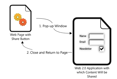
Figure 3. A Process of Sharing Content Via a Share Link
Feeding and Embedding
13. The act of browsing the Web is quickly becoming antiquated in the age of Web 2.0. As a result of RSS and RSS readers, no longer do users have to recall sites they like, enter the URL in the address bar, and go to the site to see if the site has new content. Most RSS readers provide users with the ability to read the content as pure text (or image or podcast or whatever form the content takes) or as if they were on the originating site (Figure 4).

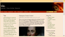
Figure 4. RSS Feeds of a Web Page in the RSS Reader Netvibes
14. Embedding also provides users with the ability to view content from one site with the space of another site. With embedding, however, users copy HTML or other code supplied by one site and paste it into the code of another site. For instance, YouTube and many other online video sites offer users the option of copying the code for a movie so that it can be embedded into a blog post. After users copy the code from YouTube, users can then paste the code onto the HTML section of a Web 2.0 application (Figure 5). Readers of the blog can then watch the video within the confines of the blog. Feeding and embedding, then, offer users the opportunity to read and interact with content without having to go to the site from which the content originates.
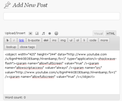
Figure 5. HTML Code for a Movie Pasted into the Add New Post Window in Wordpress
Toolbar-ing
15. Users may also engage their browser toolbar as a share function. Many Web 2.0 applications, like Shareaholic, offer browser add-ons that can be downloaded and installed into a browser. Others applications, like Twitlet, offer users the ability to merely drag a link from the Web page to the toolbar. Both functions result in a toolbar button that provides users the ability to share content from one site to another. For example, when a user finds content that they want to share, they can click on the Shareaholic button and choose from at least 30 different Web 2.0 applications with which to share the content (Figure 6). The content is then generated onto the chosen application. Toolbar buttons effectively mean that any of the infinite number of Web pages that currently exist can be shared with any of the Web 2.0 applications that accept shared content.
Implications for Usability and Usability Studies
16. These are just four of the ways that Web 2.0 facilitates the sharing of content from one site to the next, and they raise significant questions for the field of usability, including:
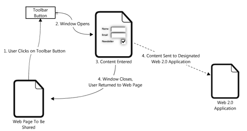
Figure 6. A Process of Sharing Content Via a Toolbar Button
- How do usability study designers determine the confines of the location of a Web 2.0 application being studied? As discussed above, Web 2.0 applications have the potential to be accessed via share features from any site on the Internet. They can also be accessed within RSS Readers and embedded into other Web sites. Should a study of a blog’s usability extend, for example, to how users interact with it while being displayed in an RSS Reader? Or how a YouTube video performs once it has been embedded into a Blogger, Xanga, or Wordpress blog? Or, what about when a blog post with an embedded YouTube video is played within the space of a RSS Reader? Do these—and the many other possibilities for sharing, feeding, and embedding—warrant individual studies? Do web site designers wash their hands of the content once it is displayed within the confines of another site?
- Whose responsibility is it to ensure the usability and functionality of each share on each page? In the past, designers have suggested that their responsibility ends when the user clicks on a link and is brought to another site. As long as the link is usable, the story has gone, they are not responsible for the content and usability of the destination site. But as we have seen, share links often result in the user returning to the original site. This means the site designer has a stake in the usability and functionality of the method by which a user is sharing content. If the window that opens to share content on, for example, Facebook, does not work properly and instead of redirecting the user back to nytimes.com directs them to Facebook, the share feature on nytimes.com has a usability issue. That is, it is not sharing content the way it should. The problem, however, does not lay within the confines of the nytimes.com domain but within Facebook’s.
- What questions will usability designers need to answer before approaching how to test for the usability of sharing? The share link, embedding, and tool bar integration features all provide the same function for users, yet they each require different actions. Web 2.0 application developers need to consider the ways in which these differences affect the way users interpret and utilize the share function. They should consider the following questions: Do users know and understand what share means? Are Web 2.0 applications using the word share consistently among one another? Will users be confused by the HTML language found in the embed coding? Which Web 2.0 applications should be included or excluded when setting up a share function?
- How do designers create studies that test how subjects share content from one site to the next and with whom should they collaborate? This is really an important question as it gets to the heart of what Web 2.0 is all about: collaborating across domains. Just as designers and developers work together to ensure the operability of APIs so too do designers need to collaborate with the designers with which their applications interact to ensure usability across domains.
Case Study: Groups, Communities, and Networks
17. The symbiotic relationships among Web sites that have emerged as a result of Web 2.0 applications suggested that we investigate how sites employ terminology and functionality. When examining the sites in our purposive sample population we found that the vocabulary varied enough that attempting to maintain a consistent user experience from site to site was difficult, if not close to impossible. Nielsen has argued that designers shouldn’t “try to be smart and use new terms when an existing term has been standardized and known by users” (Designing Web Usability 188). Examples of standardized terms include Home and Shopping Cart. We found that some sites employed different terms for the same function and others vice versa, while some sites made up new fancy terms to describe common functions. One particular example of this is the cyclical manner in which sites employed the terms group, community, and network.
Groups
18. One feature common to most Web 2.0 applications is some sort of group function, wherein users can congregate around a discussion topic. The topic of these groups ranged from the general to the esoteric. Our investigations into the functionalities of groups in Web 2.0 applications led us to define a group as a space where multiple users gather for a specific interest or purpose. We identified three main site navigation structures to access groups: first level access to groups with no category page (e.g., Esnips, DailyMotion, and Facebook); second level access to groups with no category page (e.g., Hi5, Fotolog, and Bebo); and second level access to groups with a category page (e.g. Friendster and Xanga) (Figure 7).
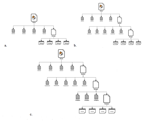
Figure 7. Three Main Navigation Paths to Access Groups
Navigation paths include a. first level access to groups with no category page; b. second level access to groups with no category page; and c. second level access to groups with a category page.
19. The ubiquity of groups suggests that they have become an expected Web 2.0 feature. Several sites, however, have called their group function something else: Xanga has labeled it a “blogring” (Figure 8); Wikia, a “wiki”; and Orkut, LiveJournal, and Esnips a “community.” Xanga’s naming system is a clear example of what Nielsen means when he warns designers against being too smart; the term “blogring” is cute but ultimately it is up to the user to figure out that each blogring is a group of likeminded bloggers. That it doesn’t take long for an intuitive user to figure out the similarities between blogrings and groups isn’t the point; the point is that users will need to make the cognitive leap on their own when no leap should be necessary. Wikia is a different and more complex example because of the ubiquity of the wiki platform. Wikis are Web sites that allow multiple users to edit the page’s content; and, indeed, any member of Wikia can edit a wiki. Otherwise, the wikis on Wikia function very much as a group, a space where multiple users gather for a specific interest or purpose. The usability question becomes: is it better to label a section of a larger domain based on its platform or its functionality?

Figure 8. Xanga Blogrings
Community
20. Our investigation led us to define the term community as a space within which other users can create groups and other content. For example, within YouTube’s Community heading are user-created Contests, Events, Groups, and Forums. As suggested above, however, we found that the word community was also employed in the same way that other sites were using group. For example, the Esnips homepage labels as communities what other sites might label as groups (Figure 9). LiveJournal announces that it has a “true sense of community” where users can “join user-created communities centered around [their] interests to share information and meet new friends. From art to zombies, if you can think of it, there's probably a community about it” (“Quick Tour”). LiveJournal, then, itself embodies the idea of community and also allows users to create and to join specific communities that explore a specific topic that in turn contribute to the site’s proclaimed community feel. Ultimately, LiveJournal communities are quite similar to other sites’ groups.

Figure 9. Esnips Homepage Navigation
21. Complicating matters, sites such as Flickr, Fotolog, Last.FM, Xanga, and YouTube refer to themselves as communities. Often these pronouncements appear in their published Community Guidelines. For example, Last.fm observes: “We’re a community of many types of people, who all have the right to feel safe and comfortable using the Last.fm Website. So, be polite and respectful—we trust you to be responsible and expect everyone in the community to respect that trust” (“Community Guidelines – Last.fm”). Flickr’s guidelines read almost exactly the same: “We're a community of many types of people, who all have the right to feel comfortable and who may not think what you think, believe what you believe or see what you see. So, be polite and respectful in your interactions with other members” (“Flickr Community Guidelines”). By referring to themselves as communities, the sites are challenging the term network that is often used to describe Web 2.0 applications.
Networks
22. Our initial definitions of the terms social network and social networking were informed by boyd and Ellison’s observations that a social network is made of people that the user knows in real life, whose relationship has been extended on the Internet, while networking describes making connections (social or professional) with people that the user does not know in real life (pars 5 - 6). A network (without the prefix, social)—what Flickr, Fotolog, Last.FM, Xanga, and YouTube seem to be labeling a community—remains the space where connections emerge. Facebook, which boyd and Ellison use as an example of a social network, also contains organizational structures called networks which group users according to their real-life geographical locations (Figure 10).

Figure 10. Facebook Networks
23. Facebook, which is referred to as a “social utility” on the Facebook Factsheet page (par. 1), is referred to by scholars as a social network, and is used for networking with members of real-life social networks who often belong to more than one organizational structure called a network. As if that weren’t dizzying enough, Ning complicates definitions further by providing a space where users can “create [their] own social network for anything” (Figure 11). If Facebook is a social network and Ning allows users to create social networks, what is Ning? Ning challenges our understanding of a network for two reasons: 1) because (unlike Facebook) there is no functioning independent of the “networks,” the actual site Ning does not resemble a network so much as a platform to launch them, and 2) what they are calling “networks” more closely resemble what most other sites would call groups.

Figure 11. Ning Home Page
24. Our investigations found that the three terms—network, community, and group—all described functions of varying similarity. Compounding the problem is the fact that none of the sites are organized similarly or all that intuitively. Ideally, we would be able to look at a site and clearly see a nesting doll: a network holds a community that holds a group. This was far from the case, though.
Implications for Usability and Usability Studies
25. The increasing cross-functionality of Web 2.0 applications makes the issue of consistent terminology (and symbols) a compelling one, and raises at least the following questions:
- Are we seeing new forms of literacy emerging from Web 2.0 applications and if so, how do we test them? Though there are the dizzying shortfalls to the varied usage of the same term across Web sites, there is also the possibility that users can and will become better at adjusting to shifting definitions as they encounter the terms in the context of different sites. Our approach to this question was to create definitions informed by the majority of sites we came across and treat the rest as outliers. Based on the usage of community as seen on Flickr, Fotolog, and Xanga, and its limited application as a synonym for group on other sites, we posited that perhaps community should be a descriptor of all the people engaged in the site, rather than a title for any sort of organized activity. A network, in that case, would be the site itself, the initial gathering place in the name of the site’s most basic function, and group would still denote a specificity of interest and purpose. These definitions are neither all-encompassing nor a perfect fit, unfortunately; each has its own exceptions, and it is possible that the distinctions are relevant only to those who are studying them in such minute detail. If so, this might suggest a newer, more flexible literacy is emerging with Web 2.0. If this is the case, then do usability advocates have to insist on standard terminologies?
- The ubiquity of symbols associated with Web 2.0 applications is just as important to consider as the new terms that are employed. How have certain symbols like a chain link (to denote the ability to make a link), a film strip (to denote the ability to embed video), and a picture frame (to denote the ability to upload an image) been employed across multiple Web sites? How can we design studies that test how users become aware of how to use these and other symbols?
- How do usability designers create effective, meaningful studies when Web 2.0 applications are emerging at such a rapid pace? In September 2008, when we began the study that informed our case studies, we identified 2,741 Web 2.0 applications. Twitter did not appear in Alexa’s Top 500 Global Sites (Movers 2.0 listed Twitter’s rank as 942 overall and the 39th most popular Web 2.0 application). As of this writing, Alexa now ranks Twitter at 80 and Movers 2.0 ranks it 10. That is, between September 2008 and April 2009 Twitter’s global popularity has increased 91.50%. There are undoubtedly hundreds more Web 2.0 applications now then when our study began. Such a rapidly changing environment necessitates usability studies designed to compliment it. Current studies do not do this and guidelines do not encourage it.
Conclusion
26. Web 2.0 applications are challenging users to learn new vocabularies, recognize the characteristics of new writing spaces that contain multiple symbiotic genres, reconceive of the relationships among multiple applications, and be able to transfer knowledge of functionality from one application to the next. Indeed, Web 2.0 is challenging the very notion of what a Web site is, something that is shown in the confusion over whether to label them applications or sites. They are also challenging the very notions of what it means for a Web site to be usable. Each of these challenges, as well as many more we have not discussed, present the field of usability with significant questions that must be addressed. Nielsen has approached Web 2.0 and usability by simultaneously labeling it “dangerous” (“Web 2.0 Can Be Dangerous”) and suggesting that usability guidelines don’t apply. The only reference to a Web 2.0 application in Prioritizing Web Usability is a captioned discussion of a teenage girl’s MySpace page, which reads:
If you want to reach a closed clique of your closest friends, usability guidelines are not going to be of much help. Of course, we could say, “Don’t use background graphics that obscure the text and make it difficult to read,” just as we can advise against having an animated heart that constantly moves around the left side of the page. And this advice would be correct for a site that has a business goal. . . . But when young people make personal sites to express their personality, traditional usability simply doesn’t apply. (xxiii)
By locating usability only within the confines of the market metaphor and dismissing sites that don’t have an economic agenda, Nielsen and Loranger are showing just how far out of touch the field of usability is with the contemporary Web (this is further shown by the fact that Nielsen’s online newsletter, Alertbox, doesn’t yet have an RSS feed). Dismissing the applicability of usability because of the supposed goals of the creator is not only condescending but dangerous. It suggests that an agenda grounded in the idea that standards are permanent structures that don’t evolve with the times. Worse, it suggests a willingness to ignore key features of contemporary Web sites. As we have shown, Web 2.0 functions are now embedded in non-Web 2.0 sites, blurring the distinction between the two. Trends suggest that as traditional media institutions continue to fail and businesses adopt zero dollar models (Anderson), this blurring will continue.
27. A more effective approach is to ask how usability might evolve to continue to make the field and practice relevant (Scott, “Is usability obsolete? (Part I)”; Scott, “Is usability obsolete? (Part II)”). Web 2.0 enhances the complex interactions users have online, celebrates the contributions of individuals, and encourages rapid experimental development. The field of usability must evolve to meet that complexity in a way that both reinforces traditional ideas about usability and remains flexible for the inevitable changes that will undoubtedly affect the ways users interact in the near and distant future.
Works Cited
“About Readability — Tx Readability from The Accessibility Institute.” 7 Mar 2009 <http://www.utexas.edu/disability/ai/resource/readability/manual/about-English.html>.
Anderson, Chris. “Free! Why $0.00 Is the Future of Business.” Wired Magazine 2 2008. 16 Mar 2009 <http://www.wired.com/techbiz/it/magazine/16-03/ff_free>.
Barnum, Carol M., and Sam Dragga. Usability Testing and Research. illustrated edition. Longman, 2001.
Clark, Joe. Building Accessible Websites. New Riders Press, 2002.
“Community Guidelines – Last.fm.” 15 Mar 2009 <http://www.last.fm/help/guidelines>.
boyd, dana m., and Nicole B. Ellison. “Social Network Sites: Definition, History, and Scholarship.” Journal of Computer-Mediated Communication 13.1 (2007): article 11.
“Factsheet | Facebook.” 15 Mar 2009 <http://www.facebook.com/press/info.php?factsheet>.
“Flickr Community Guidelines.” 15 Mar 2009 <http://www.flickr.com/guidelines.gne>.
Gould, John D., and Clatyon Lewis. "Designing for Usability—Key Principles and What Designers Think." Proceedings of CHI 1983. Boston, MA: ACM 1985. 50-53. 7 Mar 2009.
Hart, Jennefer et al. “Exploring the facebook experience: a new approach to usability.” Proceedings of the 5th Nordic conference on Human-computer interaction: building bridges. Lund, Sweden: ACM, 2008. 471-474. 7 Mar 2009
Holland, John. “Complex adaptive systems.” Daedelus 121 (1992): 17-30.
Krug, Steve. Don't Make Me Think: A Common Sense Approach to Web Usability, 2nd Edition. 2nd ed. New Riders Press, 2005.
Nielsen, Jakob. Designing Web Usability. 1st ed. Peachpit Press, 1999.
——. “Web 2.0 Can Be Dangerous.” Alertbox 12 2007. 16 Mar 2009 <http://www.useit.com/alertbox/web-2.html>.
Nielsen, Jakob, and Hoa Loranger. Prioritizing Web Usability. 1st ed. New Riders Press, 2006.
Nielson, Jakob. “Iterative Design of User Interfaces (Jakob Nielsen).” Alertbox. 7 Mar 2009 <http://www.useit.com/papers/iterative_design/>.
O'Reilly, Tim. “What Is Web 2.0 | O'Reilly Media.” 9 2005. 7 Mar 2009 <http://www.oreillynet.com/pub/a/oreilly/tim/news/2005/09/30/what-is-web-20.html>.
Pilgrim, Chris J. “Improving the usability of web 2.0 applications.” Proceedings of the nineteenth ACM conference on Hypertext and hypermedia. Pittsburgh, PA, USA: ACM, 2008. 239-240. 7 Mar 2009
“Quick Tour.” 15 Mar 2009 <http://www.livejournal.com/tour/community.bml>.
Redish, Janice. “Expanding Usability Testing to Evaluate Complex Systems - International Journal of Usability Studies.” Journal of Usability Studies 2.3 (2007): 102 - 111.
Scott, Katie M. “Is usability obsolete? (Part I).” The Feed 2 2009. 16 Mar 2009 <http://www.maya.com/the-feed/is-usability-obsolete>.
——. “Is usability obsolete? (Part II).” The Feed 3 2009. 16 Mar 2009 <http://www.maya.com/the-feed/is-usability-obsolete-part-ii>.
Slatin, John M., and Sharron Rush. Maximum Accessibility: Making Your Web Site More Usable for Everyone. Addison-Wesley Professional, 2002.
“Web 2.0 ‘neglecting good design’.” BBC 14 May 2007. 7 Mar 2009 <http://news.bbc.co.uk/2/hi/technology/6653119.stm>.
Zeldman, Jeffrey. Designing with Web Standards. 2nd ed. Peachpit Press, 2006.