The Point of PowerPoint in SophLit
Method
2. Content of
Presentations
 Our principle for selecting
images and text
was to anticipate the students' needs as readers. What
places,
persons, or themes could we introduce that would prepare them
for
the reading? What images, for example, would save them from
confusion or
help them see more vividly with their mind's eye
as they read?
For
Major British Writers I (English 221), we tested PowerPoint
presentations
on Sir Gawain and the Green Knight, the Canterbury
Tales,
The Tragical History of Doctor Faustus, King
Lear, John
Donne, and Paradise Lost. Most contained
a picture of the author and
of a locale that would give context.
To introduce John Donne, for example,
it made sense to show the
interior of St. Paul's in London, where he
ministered for so many
years.
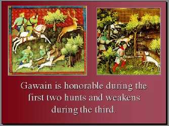
We also used images for scenes or
objects hard to visualize,
such as these scenes of the hunts in
Gawain. Some images
showed things that most students might visualize
but not very
well. To introduce Milton's Paradise Lost, our student
assistant
provided not only heavenly images (angels, etc.) to choose
from
but also different types of fruit and
snakes!

For Major British Writers II
(English 222), presentations covered
Wollstonecraft, Blake, Wordsworth,
Carlyle, Ruskin, Arnold, World
War I poets, and Lessing. Images ranged from
Blake's sketches
from Songs of Innocence and Experience to
Choctau Indians
featured in Carlyle's Past and Present to the
fields of
war-ravaged Europe for the war poets.
We wanted the
students to remember what they had seen; too
much text would distract from
the image, and we feared that students
would feel the need to copy the text
into their notes rather than
focus on the image. Based on attention-span
problems in our fall
1997 PPT classes, we chose in 1998 to make the PPT
shows shorter
and to truncate the annotation whenever possible. Each PPT
presentation
was brief--from 5 to 15 slides--and emphasized image rather
than
text.
 Our principle for selecting
images and text
was to anticipate the students' needs as readers. What
places,
persons, or themes could we introduce that would prepare them
for
the reading? What images, for example, would save them from
confusion or
help them see more vividly with their mind's eye
as they read?